Tangible and multi-sensory.
Attention is fleeting and choices are abundant. A compelling brand identity fuels recognition, allowing recall and connection amid the noise. It highlights what makes an entity unique. Most importantly, it translates concepts into visuals and narratives that resonate.
Leun believes design is a power that bridges the gap between idea and perception. He identifies and explores creative avenues that align with a brand’s core values. His intuition guides him to what makes a brand feel special, while his experience provides the technical proficiency to bring forth his vision - placing meaning in form.
Leun Gwynne x Hoag x
Leun Gwynne x Hoag x
Hoag.
Hoag's logo and visual identity were redesigned to affirm it’s 75 year dedication to innovation and providing world-class care to Orange County.
The introduction of the Whole Orange, resembling a period, positions Hoag as an answer to all of OC’s heath-care Qs. This symbolic new element holds the hospital's commitment to empowering their community.
Portraiture and narrative visuals are displayed through a modular framework that visually indicates dependability, simplicity and togetherness. Creating a rounded and cohesive visual language that resonates with the community, linking each touchpoint back to core messaging via broader identity system.
Brand identity, art direction, brand exploration, brand strategy, content creation, creative activation, video production, team and project management.


Leun Gwynne x Speks x
Leun Gwynne x Speks x
Speks.
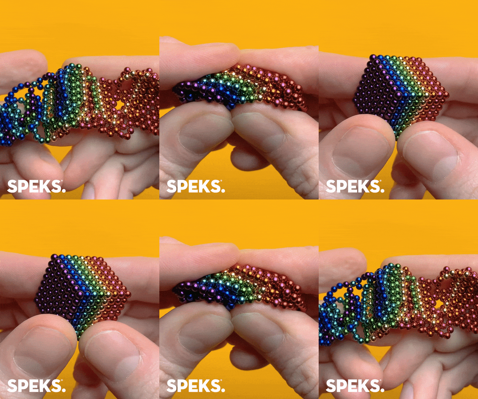
Grown up and fun, eye catching and ever irreverent; as much about brand voice and personality as aesthetics - the Speks brand was a playground that Leun had a blast in. Scroll stopping images complement oddly satisfying videos. Positive messaging and unexpected humour collide to culminate in a magnet ball filled affront to every grey office space in America.
Art direction, brand exploration, marketing strategy, content creation, community building, brand voice, copywriting, unexpected hand modelling ✌️, team and project management.
Leun Gwynne x Hudson Yards x
Leun Gwynne x Hudson Yards x
The Future is Bright - Hudson Yards
Leun was tasked with typography to complement the intricate, holiday paper cuttings of artist Bovey Lee, and their arrangement into a 50ft graphic installation; while solving the challenge of having his contribution be legible to those inside and outside of 10 Hudson Yards.
Creative direction, vision, rendering, layout, schematic reading 😱, coordination, install, team and project management.


